The hard-edged, chrome-and-neon 3D of a few years ago is quietly on its way out. In its place: rounded, squishy, almost huggable objects that look like they'd give a little if you pressed them. Soft 3D icons and plushcore avatars are the defining look of the year, and if you make or buy digital assets, this is the shift worth understanding.
This isn't a fad born from one viral dribbble shot. It's a coherent movement with real mechanics behind it - specific lighting, specific materials, specific color logic. Below is a practical breakdown of the 3D design trends 2026 is actually running on, why they resonate, and how to use them without your work looking like everyone else's.
What "soft 3D" actually means
Soft 3D is a family of styles that trade sharp reflections and photoreal grit for warmth. The shared DNA:
- Rounded everything. No hard corners. Even a "cube" gets fat, filleted edges.
- Diffuse, wraparound lighting. Soft shadows, gentle falloff, no harsh specular hotspots.
- Tactile materials. Matte clay, frosted glass, and - the newest arrival - actual fabric and plush.
- Analogous gradients. Purple-to-blue, peach-to-pink, teal-to-green. Colors that sit next to each other on the wheel, not across from it.
Three sub-styles do most of the heavy lifting right now, and they blend freely.
Claymorphism
Clay-style rendering makes objects look like soft, inflatable plastic or modeling clay. The trick is in the shading: instead of relying on a drop shadow alone, you nest highlights and shadows inside the shape. A bright inner highlight at the top-left mimics a soft reflection; a darker inner shadow at the bottom-right gives the form its rounded weight. Pastel palettes finish the look. It feels playful and approachable - which is exactly why fintech and lifestyle apps reached for it first, to soften products that could otherwise feel cold.
Glass icons
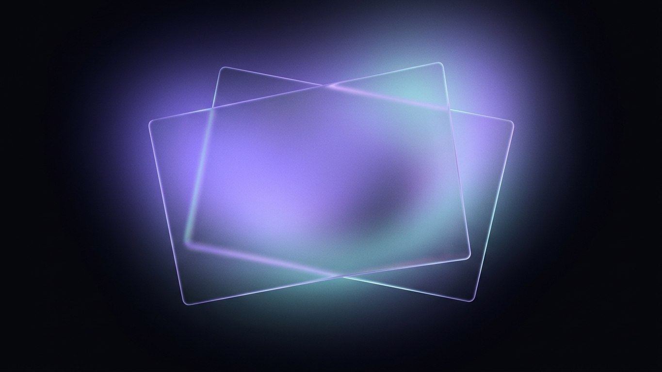
Frosted-glass rendering - translucency, blur, and a thin bright rim - jumped from full-screen UI panels into icon sets. A glass icon reads as premium and quietly futuristic, and it scales beautifully because the blur does the work even at small sizes. The best glass work in 2026 leans on those analogous gradients underneath the frost, so the icon glows rather than glares.
Plushcore
The genuinely new entry. Plushcore renders objects and characters as if they were sewn from felt, knit, or plush fabric - visible stitching, soft fuzz along the silhouette, the slightly lumpy geometry of a stuffed toy. It's the warmest end of the spectrum, and it's where a lot of the avatar work is happening.
Why the whole industry got soft at once
Trends usually have a mood underneath them. This one is about comfort.
Interfaces spent a decade getting flatter, colder, and more efficient. Soft 3D is the correction. People gravitate toward things that feel warm, safe, and touchable, and squishy pastel objects deliver that in a fraction of a second - before a single word is read.
There's a generational pull, too. The audiences designers are courting grew up surrounded by rounded, toy-like characters and 3D animated worlds. A plush avatar or a clay icon doesn't read as a "design trend" to them; it reads as familiar. That familiarity lowers the guard and makes a product feel friendly by default.
Tip: Reach for soft 3D when you want a product to feel approachable - onboarding, empty states, community features, kids' or wellness apps. Skip it when you need to signal precision or authority. A tax dashboard rendered in plush felt sends the wrong message.
Plushcore avatars: the sleeper hit
Avatars are where this trend gets emotional. A flat-illustration avatar communicates identity. A plushcore avatar communicates identity and warmth - it feels like a little companion rather than a placeholder headshot.
That's why they're spreading through community platforms, profile systems, chat products, and anything with a mascot. A few things separate the good ones from the generic:
- Silhouette first. A plush avatar has to be instantly recognizable as a tiny shape at 32px, then reward you with texture up close. Design the silhouette before the fuzz.
- Restrained palette. Two or three analogous tones per character. Plush texture already adds visual noise; loud color multiplies it into mush.
- One expressive detail. Oversized eyes, a single stitched seam, a soft cheek highlight. Pick one hero detail and let the rest stay calm.
- Consistent light source. If you're shipping a set, every avatar needs the same lighting angle or the collection falls apart the moment two sit side by side.
How to use soft 3D without looking generic
The risk with any hot style is sameness. When everyone reaches for the same pastel blob, the blob stops meaning anything. A few ways to keep your work distinct:
Mix materials on purpose. The most interesting 2026 work layers styles - a glassmorphic panel floating over a clay surface, or a plush character holding a glass object. The contrast between frost and fuzz creates depth that a single material can't.
Commit to a lighting story. Generic soft 3D uses flat, even, "studio" light. Distinctive soft 3D picks a direction and a warmth - a low golden key light, or a cool rim from behind - and applies it religiously across the whole set.
Anchor the palette to your brand, not the trend. Pastels are the default, but soft 3D works in deeper, moodier tones too. A dark UI with softly glowing glass icons feels far more premium than another mint-and-lavender set.
Respect the small sizes. Soft shadows and subtle inner highlights vanish when an icon is scaled to 20px. Test everything at its smallest real deployment size and thicken the cues that disappear.
Callout: The fastest way to date your work is to over-blur. Extreme glassmorphism and mushy claymorphism both read as "2023." The 2026 refinement is restraint - just enough softness to feel tactile, enough edge definition to stay legible.
A quick reality check on production
Soft 3D is deceptively expensive to make well. The materials - subsurface scattering for plush, refraction for glass, nested shadows for clay - are exactly the settings that eat render time and reward experience. A wonky highlight or an inconsistent bevel is instantly visible because the style has nowhere to hide.
This is the honest case for starting from a well-built asset pack rather than modeling every piece from scratch. A cohesive set gives you consistent lighting, matched materials, and a shared silhouette language out of the box - the hard-won consistency that makes a collection feel intentional instead of assembled.
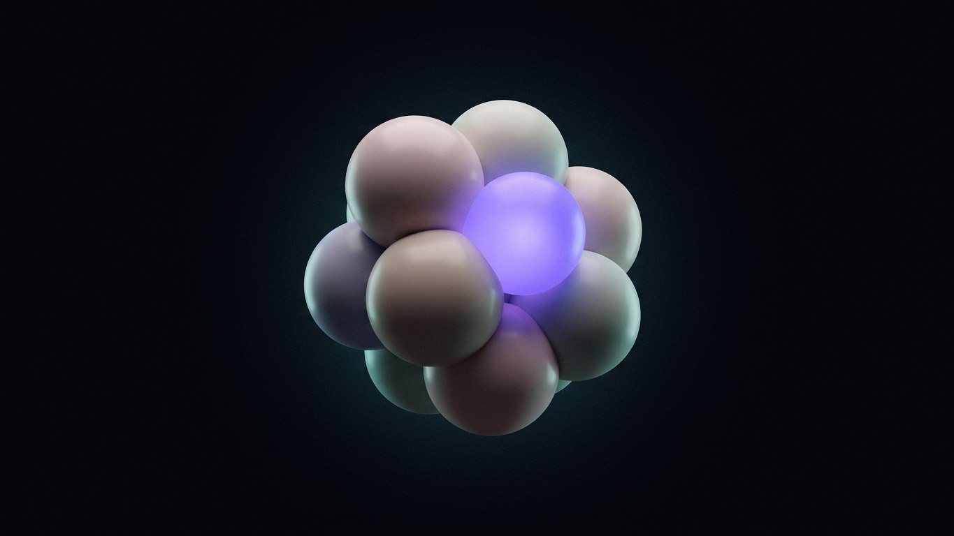
If you want to put the trend to work without spinning up a render pipeline, NyxMarket's design assets are built for exactly this moment. The Radiant 3D glass icons bring the frosted-glass look with clean, scalable geometry, and the Cute 3D Avatars set leans straight into the plushcore mood for profiles, communities, and mascots. For softly glowing accents and hero moments, the Voxa 3D voice orbs round out the kit.
Or browse the full catalog and mix a set that matches your palette rather than the crowd's. The trend rewards taste, not volume - pick the pieces that feel like your product, and let the softness do the quiet work of making people feel welcome.