Glassmorphism had its viral moment, got declared dead about four times, and then quietly won. Walk through any polished product interface in 2026 and you'll find frosted panels floating over dark gradients, translucent nav bars, and cards that feel like they're made of tinted glass. It didn't survive because it's pretty. It survived because when it's done right, it does real work: it creates depth, establishes hierarchy, and makes an interface feel physical without the heavy skeuomorphism of the 2010s.
The catch is that "done right" is a narrow target. Glassmorphism is one of the easiest styles to fake and one of the hardest to ship well. This guide is about the difference - the practical decisions that separate a glass UI that looks premium from one that looks like a Dribbble shot nobody could actually use.
Why glass and dark mode belong together
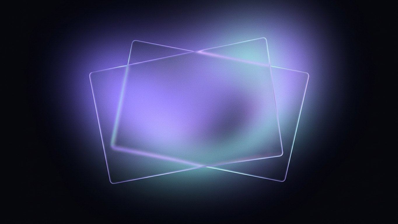
Glassmorphism and dark mode aren't just compatible in 2026 - they're symbiotic. Frosted glass is defined by what's behind it. On a flat white background, a translucent panel has almost nothing to refract, so the effect collapses into a vague gray smear. On a dark, layered background with a hint of color, that same panel comes alive: it picks up the glow of a gradient, separates cleanly from the content beneath it, and reads instantly as "a surface floating above other surfaces."
Dark mode also gives you a forgiving canvas. Light bleeds and blur artifacts that scream on white are subtle on charcoal. That's why nearly every strong glass interface you'll see this year is dark-first, with the light theme treated as a careful adaptation rather than the primary design.
Rule of thumb: never design glass on a solid color. Give the section a subtle gradient or a soft radial wash first, then place the glass on top. If you can't see the blur working, there's nothing behind it to blur.
Kill pure black
The single most common dark-mode mistake is reaching for #000000. Pure black is a trap: it flattens depth, makes shadows invisible, and produces harsh halation around light text on OLED screens. Build your dark theme on a very dark neutral instead - something in the #0B0D12 to #14161C range - and layer slightly lighter surfaces on top of it. That tonal ladder is what lets glass panels feel like they're above the page rather than punched into it.
The anatomy of a glass surface
A convincing glass panel is not one CSS property - it's a small stack of them working together. Get any one wrong and the whole thing reads as cheap. Here's the recipe I reach for:
- A translucent fill, not a transparent one. Something like
rgba(255,255,255,0.06)on dark backgrounds. You want the panel to have its own faint body, not to be a pure window. - A backdrop blur in the 8-16px range via
backdrop-filter: blur(12px). Below 8px the effect barely registers; above 20px it turns to mush and gets expensive to render. - A hairline border - a 1px stroke at low opacity (
rgba(255,255,255,0.12)) - to define the panel's edge where the blur alone won't. This "light edge" is what your eye reads as the rim of the glass. - A soft, low-opacity shadow to lift the panel off the background and sell the sense that it's floating.
- Optional inner highlight - a subtle top-edge gradient - to mimic light catching the surface.
Always ship -webkit-backdrop-filter alongside the standard property. Safari still needs the prefix, and forgetting it is the reason "the blur works on my machine but not the client's."Tune the values, don't copy them
Those numbers are starting points, not gospel. Blur strength, fill opacity, and border brightness all shift depending on what's behind the glass and how busy it is. A panel over a calm gradient can be more transparent; a panel over a photo or dense UI needs a stronger fill so text stays readable. Design the panel and its background together - they're one system.
Where glass helps, and where it hurts
Glass is a spice, not a base coat. The interfaces that age badly are the ones that made everything glass - every card, every button, every modal - until the hierarchy dissolved and nothing felt primary.
Use glass for elements that are conceptually "above" the content:
- Navigation bars and floating headers that sit over scrolling content
- Modals, popovers, and command palettes
- Notification toasts and floating action panels
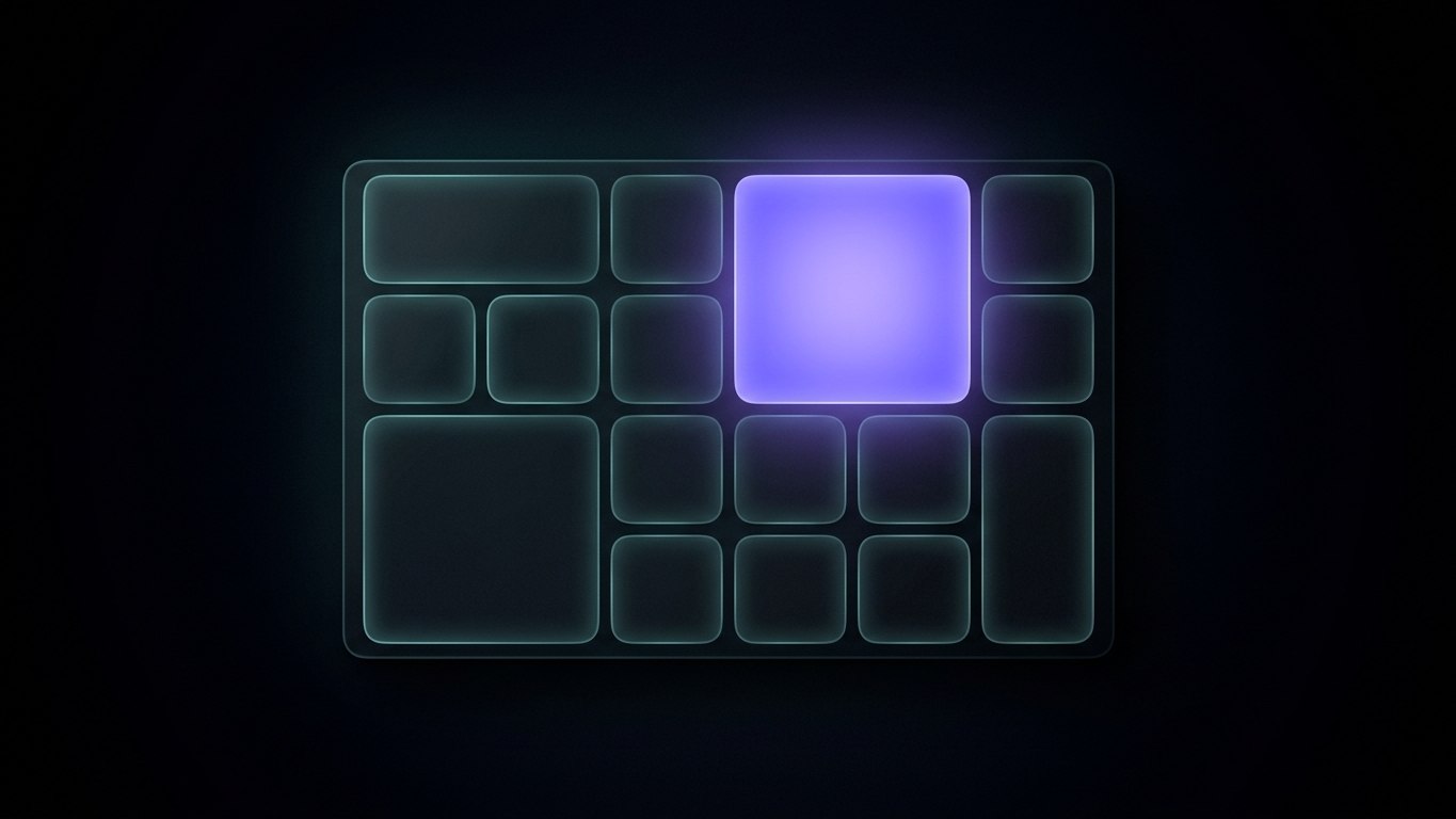
- A single hero card meant to be the focal point
Keep it off dense, text-heavy surfaces: long-form reading areas, data tables, settings forms. Those want solid, high-contrast backgrounds where legibility beats atmosphere. The best glass UIs use restraint - a few glass moments against mostly solid surfaces, so the translucent elements actually feel special.
Accessibility is not optional
This is where most glass interfaces fall apart, and where you can quietly beat 90% of them. Translucency and blur are contrast killers, and contrast is what makes text readable for everyone - not just users with low vision.
Hold your text to WCAG 2.2 minimums: at least 4.5:1 contrast for body text and 3:1 for large text and interactive UI components. The problem with glass is that the effective background behind your text keeps changing as content scrolls beneath it. Two defenses:
- Put a semi-opaque fill behind any text sitting on glass, so its background is predictable regardless of what's underneath.
- Test with real content, not a hand-picked calm backdrop. Scroll a busy page under your glass nav and check that the worst-case contrast still passes.
Then respect the users who need less: honor prefers-reduced-transparency and swap your blurred panels for solid, high-contrast surfaces when it's set. Do the same for prefers-reduced-motion on any animated glass. This isn't a nice-to-have - blur and parallax can trigger discomfort for people with vestibular sensitivity, and older or cheaper hardware chokes on heavy backdrop-filter animation and drops frames.
Performance: blur is expensive
backdrop-filter is one of the more costly things you can ask a browser to paint, because it has to sample and blur everything behind the element on every frame. A static glass panel is cheap. A glass panel that animates, moves, or has animated content behind it can tank your frame rate on mid-range phones.
Practical guardrails:
- Keep blur radii moderate.
blur(12px)andblur(24px)don't look twice as different, but the second costs far more. - Avoid animating
backdrop-filteritself. Fade the panel's opacity or transform it instead. - Limit how many overlapping glass layers stack on screen at once.
- Always provide a solid fallback for browsers or contexts where the effect fails, so the layout never breaks.
Pulling it together in 2026
The through-line for glassmorphism this year is maturity. It's no longer a trend you bolt on to look modern - it's a material you use deliberately, with dark, layered backgrounds to give it something to refract, tight contrast discipline to keep it usable, and performance budgets to keep it smooth. Treat glass as one element in a considered system and it reads as premium. Treat it as decoration and it reads as dated within a season.
The fastest way to internalize this is to study interfaces that already got the details right - the tonal ladders, the hairline borders, the restraint. Our website templates are built dark-first with exactly these glass-and-depth principles baked in, so you can see the technique in production rather than in a static mockup. If you want a running head start, AVALON is a strong reference build for the dark-glass aesthetic, and pairing it with the Radiant 3D glass icons gives you a matching visual language out of the box.
Design the environment first, keep the glass honest, and let the dark do the heavy lifting.